

Designing a CEP cover is a team effort. Editors present images and pitch ideas for their article to be featured, then our art director applies her magic and prepares a few concepts for us to consider. We go back and forth a few times — tweaking colors, shades, fonts, type sizes, and other elements of the design — until we arrive at the work of art that greets you when CEP lands on your desk. This month’s cover and the special section on food engineering were finished before I came across an interesting study about fonts and food. Had I read about the research earlier, I might have suggested we use the font you see below for the menu of articles on p. 31.
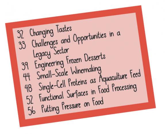
In her article “Changing Tastes” (p. 32), Liz Pavone notes, “Motivated by an increased understanding of health and nutrition, as well as a focus on the environmental impact of what we eat, today’s consumers are demanding something different from the food industry.” In line with this, “the restaurant industry has witnessed an unprecedented rise of healthy restaurant brands,” says Stephanie Liu, a professor of hospitality management in the Ohio State Univ. Dept. of Human Sciences. However, Liu and her colleagues say, the existing literature offers little guidance on how to effectively leverage such brands in the marketplace.
Liu’s team drew on previous research findings that consumers’ health values affect their intention to choose healthy foods, that marketing communications influence consumers’ perceptions of a restaurant, and that typeface design is an effective marketing tool in communicating brand personality. They then examined the effect of menu font on a diner’s perceptions and choices.
They asked 185 U.S. adults to imagine themselves patronizing a fictitious restaurant. Half of the participants were told the establishment was “a health-conscious restaurant, its entire menu is based on locally grown, non-GMO, antibiotic-free ingredients, and it is committed to sustainability,” while the other group did not receive such information. Half of each group saw a menu created in the Helvetica font, while the other half saw the same menu prepared with the typeface below, which appeared to be handwritten.
When the diners read menus with healthy food options printed in the typeface that looked to be handwritten, they were more likely to believe that the food was healthier, made of better ingredients, and prepared with more care than similar items printed in the machine-style font. The handwritten font, Liu believes, conveys “a sense of human touch, which subsequently induces the perception that love is symbolically imbued in the restaurant’s offerings.” This, she says, produces “a wide range of favorable consumer responses, including positive attitudes toward the menu, enhanced perceived healthiness of the brand, and higher social media engagement.”
She theorizes that as the world grows ever-more automated and ever-more mechanized, technology can put distance between humans and remove the warmth that comes with human touch. Because hand-writing takes more effort than typing, a typeface that appears handwritten can convey a deeper sense of emotional connection than a machine-written typeface that is square, straight, and uniform.
Had we used the font you see here, would the love that went into the section on food engineering be more evident?
1

Copyright Permissions
Would you like to reuse content from CEP Magazine? It’s easy to request permission to reuse content. Simply click here to connect instantly to licensing services, where you can choose from a list of options regarding how you would like to reuse the desired content and complete the transaction.